| Category / Domain : | Interface |
| SCOL Voy@ger Compatibility : | V 3.5 or above |
| Update : | 2001/08 |
The GraphicCheckBox module creates a 2 states - button on the client interface. It can
be customized using a bitmap.
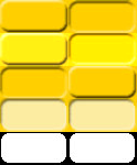
This bitmap contains the various states of the button pasted
vertically and horizontally.
This button is used to generate an action in the 3D scene or through any other module.
 |
The 5 states are (from bottom to top) :
# Horizontally : (the state of the button is double) # Vertically :) |

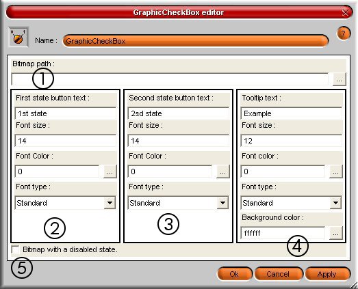
Figure 1 : GraphicChecBox module interface
| (1) : Bitmap path | Indicates the path of the bitmap file used for the button ; click on … to select a file which will necessarily have to be saved in the SCOL partition |
| (2) : Non ticked text state | Indicates the text
which is visible on the button (not ticked state) : - font size : Specifies the size of the font used for the text of the button. This value is expressed in point unit. - font color : Specifies the colour of the text of the button ; it is possible to enter the hexadecimal code of the wished colour either to click the button to open a palette to choose a colour either to enter the RGB or HSV codes. - font type : Specifies the font style (normal, bold, italic, underlined, strikeout). |
| (3) : Ticked text state | Indicate the text
which is visible on the button (ticked state) : - font size : Specifies the size of the font used for the text of the button. This value is expressed in point unit. - font color : Specifies the colour of the text of the button ; it is possible to enter the hexadecimal code of the wished colour either to click the button to open a palette to choose a colour either to enter the RGB or HSV codes. - font type : Specifies the font style (normal, bold, italic, underlined, strikeout). |
| (4) : Tooltip text | Indicates the text
which is visible in the tool-tip : - font size : Specifies the size of the font used for the text of the tool-tip. This value is expressed in point unit. - font color : Specifies the colour of the text of the tool-tip ; it is possible to enter the hexadecimal code of the wished colour either to click the button to open a palette to choose a colour either to enter the RGB or HSV codes. - font type : Specifies the font style (normal, bold, italic, underlined, strikeout) - background color : Background colour used for the text of the tool-tip coded in hexadecimal. |
| (5) : Bitmap with a disabled state | If the image has
a representation of the 'désactivé' (deactivated) state, this box must be
ticked. Following types of files are possible for the bitmap :
|
The bitmap can have any size, but its
shape must be the same as the one of the button.
If no image is provided or if the filename is not valid, a default image is used.
It is possible to define different texts for the ticked and unticked states.
While the creation, the button is visible and activated is unticked.
| Action | Function |
| module.event ŕ GraphicCheckBox.start | Allows to start the module and to show the button in the client graphic interface |
| module.event ŕ GraphicCheckBox.destroy | Stops the GraphicCheckBox module at the client side |
| module.event ŕ GraphicCheckBox.show | Shows the button at the client side |
| module.event ŕ GraphicCheckBox.hide | Hides the button at the client side |
| module.event ŕ GraphicCheckBox.enable |
Activates the button |
| module.event ŕ GraphicCheckBox.disable | Deactivates the button |
| module.event ŕ GraphicCheckBox.check | Allows to control the "checked" flag of the button from another module. This is possible even if the checkbox is in the deactivated state. |
| module.event ŕ GraphicCheckBox.uncheck | Allows to control the "unchecked" flag of the button from another module. This is possible even if the checkbox is in the deactivated state. |
| Event | Function |
| GraphicCheckBox.in à module Action | The client part of the module is started and ready to receive events |
| GraphicCheckBox.out à module Action |
Exiting from the module generates an action |
| GraphicCheckBox.entering à module Action | Entering in the module generates an action |
| GraphicCheckBox.shown à module Action | The display of the button generates an action |
| GraphicCheckBox.hidden à module Action | Hiding the button generates an action |
| GraphicCheckBox.enabled à module Action |
The activation of the bitmap pasted on the button generates an action |
| GraphicCheckBox.disable à module Action | The deactivation of the bitmap pasted on the button generates an action |
| GraphicCheckBox.check à module Action | The change of state of the button generates an action |
| GraphicCheckBox.uncheck à module Action | The change of state of the button generates an action |
| Zone | Function | Interface | Assignment |
| graphicCheckBox.button | Displays the button | Client | Yes |